Surf Shop is a local Coffee House that not only provides delicious coffee beverages but, offers refreshing nutritious dense smoothies and juices. This package system was created to bring the best drinks Surf Shop has to offer into a main stream market.
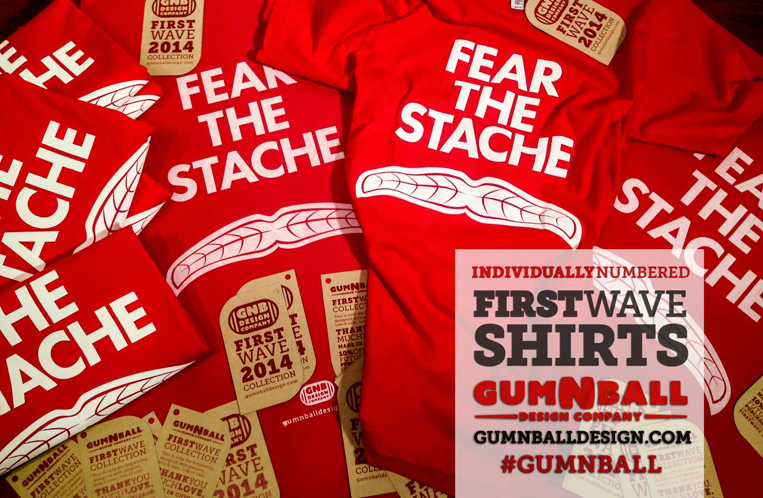
GNB Design is small design studio currently focused on creating quality t-shirts based around the culture of Chicago sports teams. "Fear the Stache" is the first design. It represents Joel Quenneville of the Chicago Blackhawks hockey team. Coach Quenneville is one of the most respected coaches in the NHL and know for his intimidating mustache.
Publication for Columbia College Zine, that incorporates writers, photographers, illustrators and designers to show off their creative work. Published Annually.
Hand Illustrated cover, inside spread painted with experimental typography.
Purpose of this project was to create an identity system for a film festival that could be easily incorporated into various print materials. Challenge was to incorporate crucial information into the logo without loosing legibility. Logo combines a simplified Chicago skyline with a ticket stub.
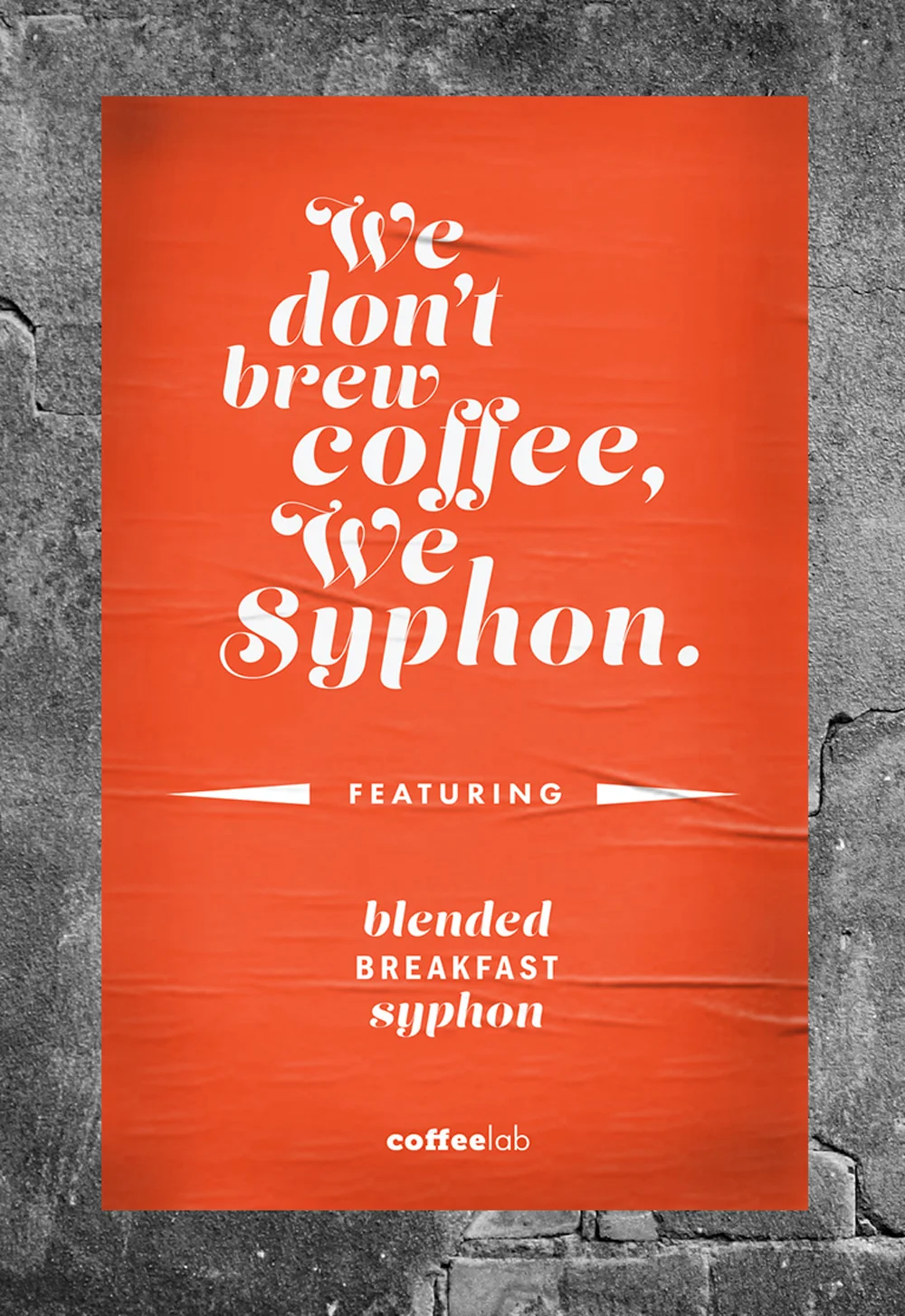
Coffee Lab is a new up and coming coffee drinking experience concept. Existing businesses with established client base, will be able to incorporate this full package coffee bar into their stores with ease and have instant additional revenue.
This book was designed with respect and gratitude to the Bauhaus movement that was started in Weimar Germany in 1919. First half of the Bauhaus book was designed in traditional modernist Bauhaus style. The other half of the book presents a modern experimental design.
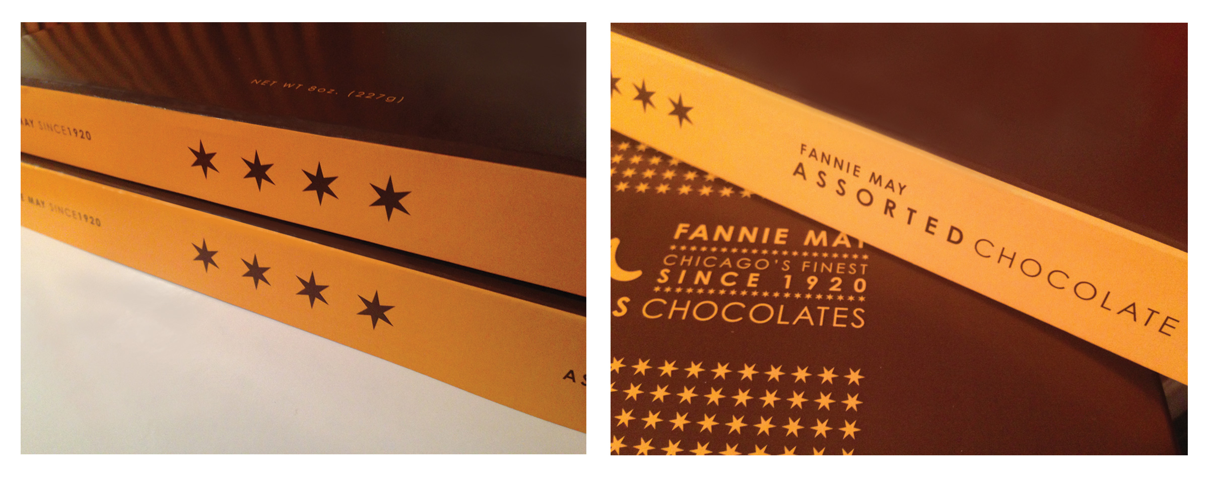
Fannie May is a chocolate company based in Chicago with a rich history. The company has grown over many decades into a nationally recognized brand. The brand identity and packaging was in need of a overhaul.
The logo was redesigned with a elegant flair to convey a hand made human touch. Using the F and M as the primary symbol, allows for quicker brand recognition. The use of the Chicago flag ties the brand into the roots and history of the city. The elements of stars and stripes of the flag were incorporated into the packaging across the whole system for continuity.